PT
Cliente: Capodella — Moda Feminina Multimarcas Premium. Setor: Varejo, São Paulo
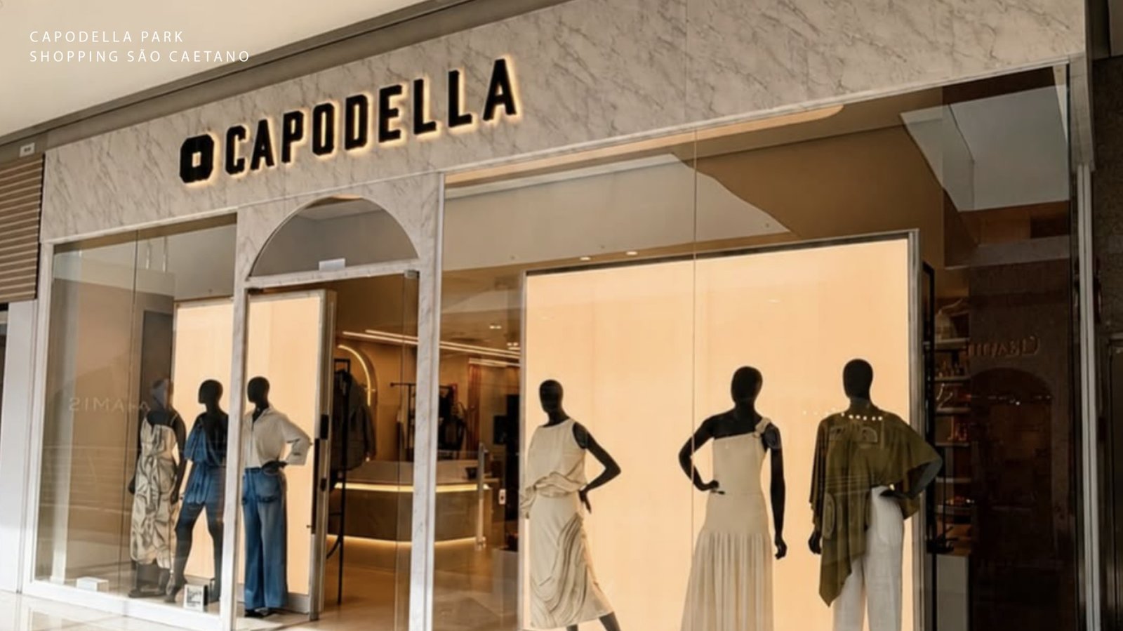
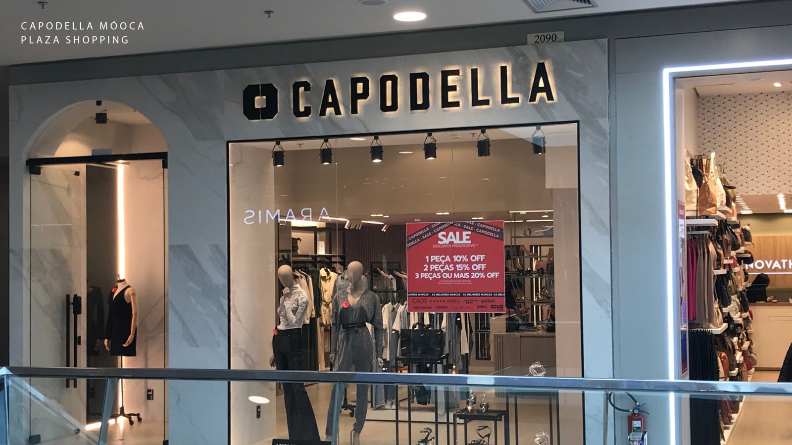
Uma nova loja de moda feminina multimarcas no Mooca Plaza Shopping, com marcas como Lança Perfume e Schutz — e sem nenhum briefing. O ponto de partida foi uma ideia e a confiança de uma cliente que já conhecia o trabalho.
O desafio foi criar não apenas uma identidade visual, mas o próprio conceito da marca: nome trabalhado graficamente, posicionamento, atmosfera e proposta de valor. A Capodella nasceu em torno da ideia de liberdade de escolha — um guarda-roupa feito de múltiplos estilos, onde cada peça compõe algo único e pessoal.
EN
Client: Capodella — Premium Multi-Brand Women’s Fashion. Industry: Retail, São Paulo, Brazil
A new women’s multi-brand fashion store at Mooca Plaza mall, carrying labels like Lança Perfume and Schutz — and zero creative brief. The starting point was an idea and the trust of a client who already knew the work firsthand.
The challenge wasn’t just designing a visual identity. It was building the brand concept from scratch: the graphic treatment of the name, the positioning, the store’s atmosphere, and its core value proposition. Capodella was built around the idea of freedom of choice — a wardrobe drawn from multiple styles, where each piece becomes part of something personal and unique.
Grafismo
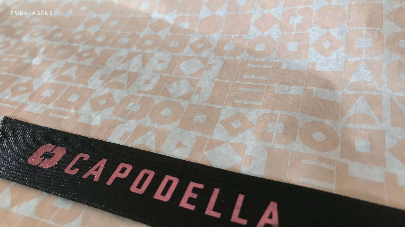
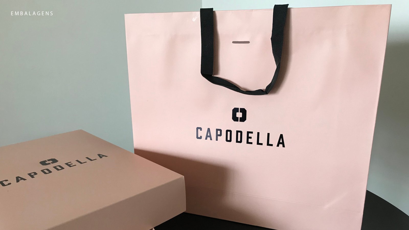
A partir do C e do D que formam o símbolo, foram desenvolvidas versões geométricas de todas as letras do nome Capodella — criando um alfabeto visual exclusivo da marca.
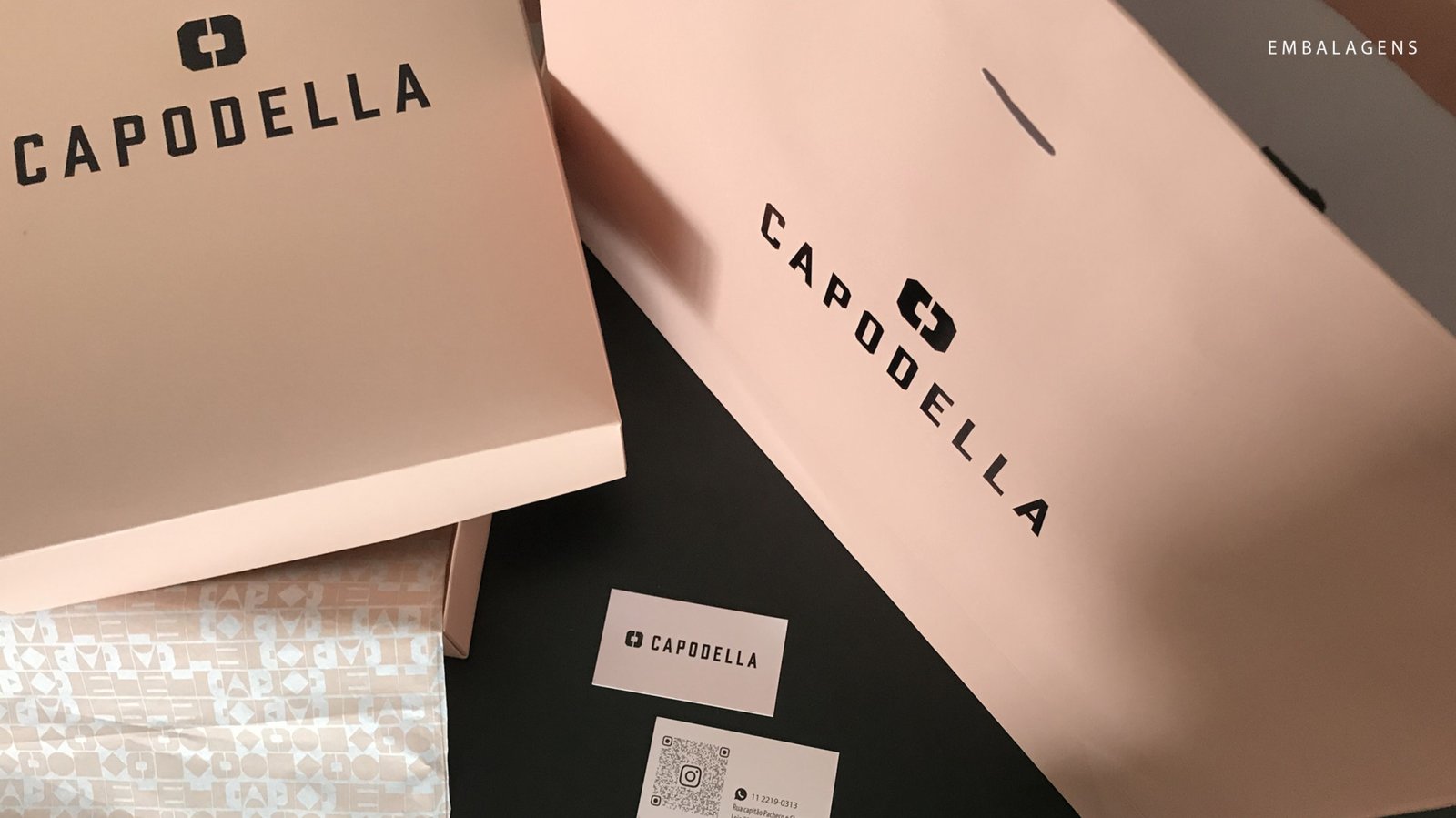
O resultado é um sistema gráfico que pode ser aplicado como textura, fundo ou elemento de apoio em qualquer material, mantendo a identidade reconhecível mesmo sem o logotipo principal à vista.
Um detalhe intencional: a forma do A final é também a forma da metade da bandeira do Brasil, revelando a origem da marca de forma sutil, quase como um segredo para quem sabe olhar.
Brand Graphics
Starting from the C and D that make up the symbol, geometric versions of every letter in Capodella were developed — creating a custom visual alphabet unique to the brand.
The result is a graphic system that works as texture, background, or supporting element across any material, keeping the brand recognizable even when the main logo isn’t in the picture.
One intentional detail: the shape of the final A is also the shape of half the Brazilian flag — a quiet nod to the brand’s roots, hidden in plain sight for those who know where to look.