PT
Cliente: Edifício Patrimônio. Avenida Paulista, São Paulo – Setor: Gestão de Condomínio Comercial
Uma parceria em duas fases com o Edifício Patrimônio, condomínio comercial na Avenida Paulista. Tudo começou com a criação da Revista Patrimônio — uma solução editorial mensal desenvolvida para resolver a comunicação interna do edifício, engajar os condôminos e promover os negócios entre as empresas do prédio. Projeto validado e em operação contínua há mais de dois anos.
Com a revista consolidada, o passo seguinte foi o redesign completo da identidade visual da marca, lançado em janeiro de 2026. Além disso, produzimos mensalmente os posts para as redes sociais do condomínio — texto e design.
EN
Client: Edifício Patrimônio. Paulista Ave, São Paulo, Brazil – Industry: Commercial Building Management
A two-phase partnership with Edifício Patrimônio, a commercial building on Avenida Paulista — São Paulo’s most iconic avenue. It started with the creation of Revista Patrimônio — a monthly digital magazine built to solve the building’s internal communication gap, keep tenants engaged, and give the businesses inside a channel to promote themselves to each other. The magazine has been running continuously for over two years.
With the magazine well established, the next step was a full brand redesign, launched in January 2026. On top of that, we handle the building’s social media every month — copy and design.
Redesign de Marca
O processo começou com pesquisa de público e análise de concorrentes, seguida de um alinhamento sobre os valores e propósito do condomínio — base para todas as decisões criativas que vieram depois.O novo logotipo foi construído a partir da própria arquitetura do edifício: a fachada estilizada, com sua característica faixa azul, virou símbolo. A tipografia escolhida é sem serifa — moderna, minimalista e versátil. Funciona bem em qualquer tamanho, do título à sinalização miúda, e carrega uma neutralidade que comunica profissionalismo sem perder acessibilidade. Uma escolha que reforça o caráter sólido e contemporâneo da marca.
Brand Redesign
The process started with audience research and a competitive analysis, followed by a values and purpose alignment with the client — the foundation for every creative decision that followed.
The new logo was built from the building’s own architecture: a stylized version of the facade, featuring its distinctive blue band, became the symbol. The chosen typeface is sans-serif — modern, clean, and versatile. It holds up at any size, from headlines down to small signage, and carries a neutrality that reads as professional without feeling cold. A choice that reinforces the brand’s solid, contemporary character.


Entregas:
- Logotipo e sistema de identidade visual
- Tagline (slogan) da marca
- Iconografia
- Papelaria — envelopes, cartões
- Placas de sinalização interna
- Layout de posts e banners para redes sociais
- Templates de apresentação institucional e comercial
Deliverables:
- Logo and full visual identity system
- Brand tagline
- Iconography
- Stationery — envelopes, business cards
- Interior signage
- Social media post layouts and banners
- Institutional and commercial presentation templates


Revista Patrimônio — Design Editorial
Antes do redesign da marca, identificamos um desafio diferente: o condomínio não tinha um canal de comunicação interna eficiente. Grupos de WhatsApp, ruídos, boatos — e um síndico sobrecarregado com demandas que poderiam ser resolvidas com informação clara e acessível.
Desenvolvemos uma solução simples, econômica e eficaz: uma revista digital mensal com identidade visual própria, cujo conceito se encaixa diretamente no propósito da marca — Tradição, inovação, cultura e negócios.
Há mais de dois anos em operação, a Revista Patrimônio é hoje o canal de comunicação oficial do condomínio. Informa, educa e engaja os condôminos, elimina ruídos, e cria um espaço para que as empresas do edifício se promovam entre si.
As edições estão disponíveis em edificiopatrimonio.com.br.
Patrimônio Magazine — Editorial Design
Before the brand redesign, we identified a different challenge: the building had no reliable internal communication channel. WhatsApp groups, noise, rumors — and a building manager buried in requests that could have been solved with clear, accessible information.
We designed a simple, cost-effective solution: a monthly digital magazine with its own visual identity, built around the building’s core purpose — Tradition, innovation, culture, and business.
Running for over two years, Revista Patrimônio is now the building’s official communication channel. It keeps tenants informed, builds community, cuts through the noise, and gives the businesses inside a space to promote themselves to each other.
All issues are available at edificiopatrimonio.com.br.
Identidade Visual da Revista
A revista precisava de uma identidade própria — distinta da marca do condomínio, mas conectada a ela.
O símbolo é a letra P: de Patrimônio, de Paulista. Mas não um P qualquer — seus blocos são construídos em sequência, como se desenhados em um único traço contínuo: da base, subindo, contornando e retornando à haste principal. O caminho percorrido forma um quarteirão. Quatro direções, quatro blocos, quatro cores.
A metáfora é precisa: a Avenida Paulista é movimento, é fluxo, é gente para todos os lados. Muitos dos condôminos escolheram o endereço exatamente por isso — acesso fácil a tudo, oportunidades em todas as direções.
A paleta reflete essa dualidade. O azul escuro e o azul médio trazem sobriedade e ancoragem — a solidez do edifício, a tradição da avenida. As cores de apoio entram como pulso: a cidade vibrante, acesa, ligada 24 horas.
A tipografia escolhida foi a Josefin Sans Bold — geométrica, limpa, com personalidade. Reforça o caráter urbano e contemporâneo da publicação sem abrir mão da legibilidade.
Magazine Visual Identity
The magazine needed its own identity — distinct from the building’s brand, but connected to it.
The symbol is the letter P: for Patrimônio, for Paulista. But not a standard P — its blocks are built in sequence, as if drawn in a single continuous stroke: starting from the base, moving up, curving around, and returning to the main stem. The path traces a city block. Four directions, four blocks, four colors.
The metaphor is precise: Avenida Paulista is movement, flow, people going everywhere at once. Many of the building’s tenants chose this address for exactly that reason — easy access to everything, opportunity in every direction.
The color palette reflects that duality. Dark blue and medium blue bring solidity and calm — the weight and tradition of the building. The accent colors come in as pulse: the avenue vibrant, electric, running 24 hours. The chosen typeface is Josefin Sans Bold — geometric, clean, with character. It reinforces the publication’s urban, contemporary personality without sacrificing readability.


Projeto Gráfico
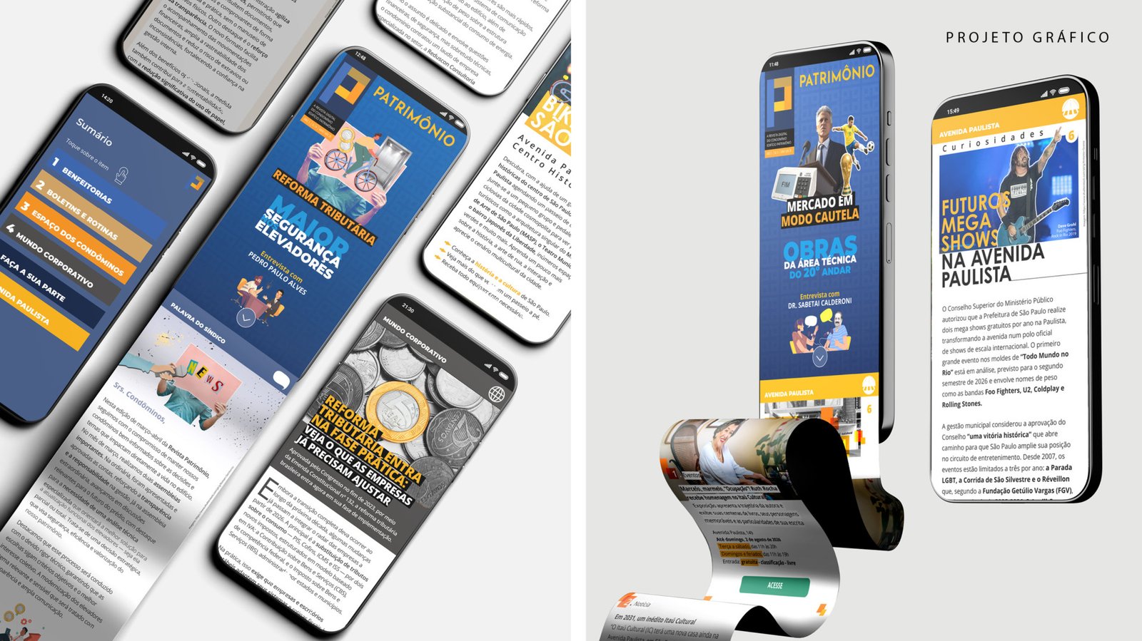
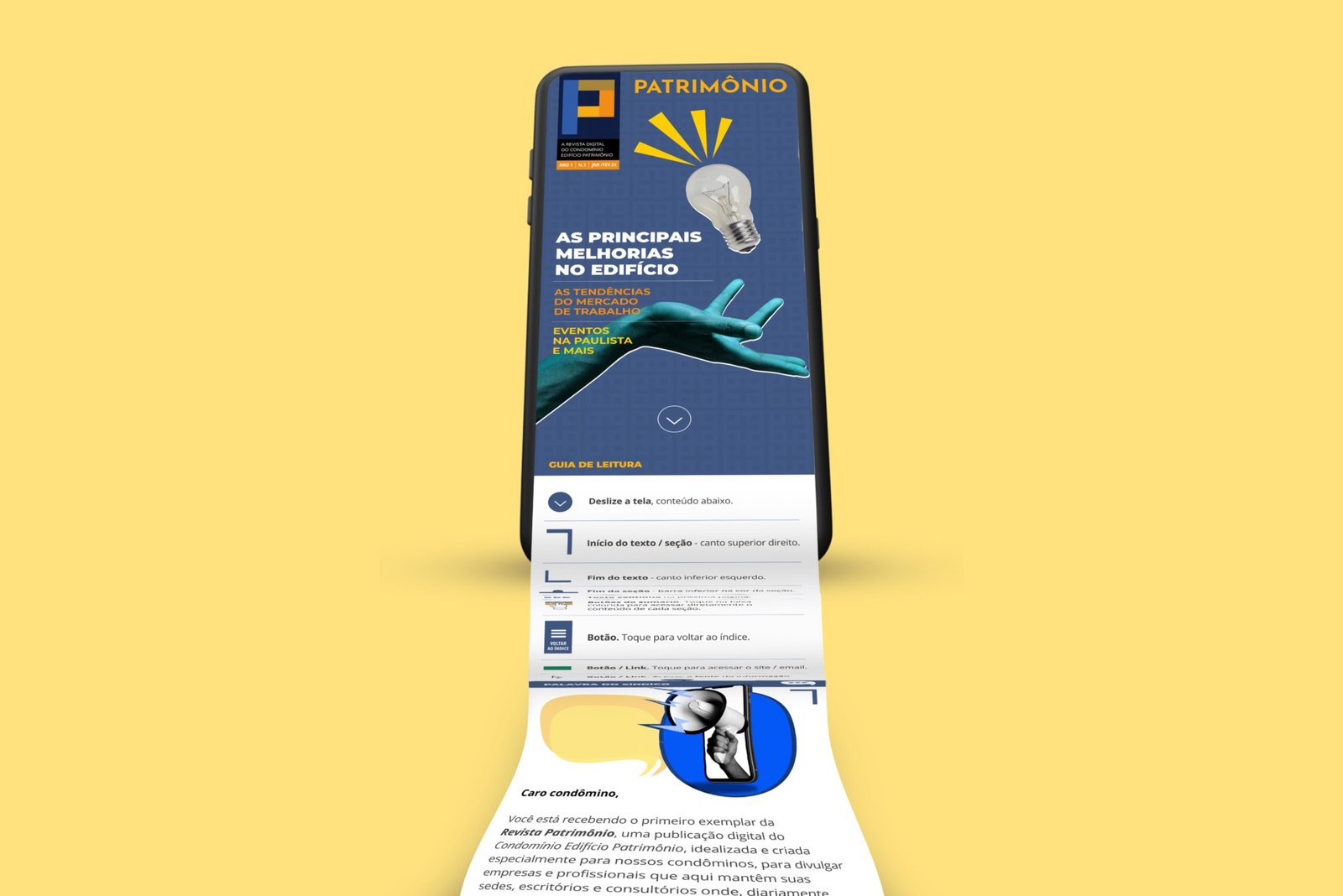
Para uma revista plural, dinâmica e diversa como a Paulista, o estilo visual precisava acompanhar. A linguagem escolhida foi o collage — recortes, composições com ilustrações e imagens, padrões e grafismos que tornam cada página visualmente rica sem pesar na leitura.
O resultado é uma publicação leve e descontraída, mas com acabamento editorial profissional: espaçamentos calibrados, botões e links interativos pensados para uma experiência de leitura digital fluida em qualquer dispositivo.
Editorial Design
For a magazine as plural, dynamic, and diverse as Paulista itself, the visual language had to match. The chosen style was collage — cutouts, mixed compositions of illustration and photography, patterns and graphic elements that make each page visually rich without getting in the way of reading.
The result is a publication that feels light and engaging, while still holding up to professional editorial standards: calibrated spacing, interactive buttons and links designed for a smooth digital reading experience across any device.